Event Poster Design: A Step-by-Step Guide to Posters That Get Results
Xin Liu · Founder & Design Service Advisor
Xin helps business owners navigate the freelance design marketplace. He researches platforms, compares services, and publishes practical guides to help you make confident hiring decisions.
Event Poster Design: Why Your Poster Isn’t Getting Results
Event poster design that fails to connect with your audience is exactly the frustration that makes proper planning so critical. A business owner spends weeks preparing, invests in printing, and the poster itself fails to do its job. In this guide, we’ll walk you through the step-by-step process that actually works: from defining your audience to choosing between print and digital formats.
First, set expectations on budget: a small one-off community event and a multi-city film campaign don’t live in the same price range. From our 11-gig Fiverr dataset, everyday event posters start around $14 to $45 while campaign or film-style posters run $98 to $369. Read how much does poster design cost to pick your tier before you dive into the design.
2026 Event Poster Pricing: What You Actually Pay on Fiverr
We pulled the actual Basic/Standard/Premium tier prices from 11 top-rated Fiverr poster gigs (every one a Level 2 or Top Rated seller with 600+ reviews, verified on the gig page) out of a pool of 163 “poster design” listings in Fiverr’s Poster Design category scraped in September 2026.
| Tier | Median Price | Range Across the 11 Gigs | Best For | Typical Deliverables |
|---|---|---|---|---|
| Budget / Starter | $72 (flattened to entry) | $14 to $130 | Simple events, social promos, quick tests | 1 design, JPG/PNG, 1 to 3 revisions |
| Professional ⭐ | $88 | $30 to $211 | Most events | Print-ready files, source files (AI/PSD), multiple sizes, unlimited revisions |
| Premium / Top Rated | $112 | $56 to $369 | Campaigns, brand events, complex needs | Full campaign set, brand integration, mockups, priority support |
Data source: 11 qualifying top-rated gigs out of 163 listings (Fiverr Poster Design category, pages 1 to 5), scraped September 2026 via Playwright. Download the dataset and the per-tier deliverable dataset. All prices are seller-listed USD with service fees included.
Key findings from our data:
- The poster market is sparse. Only 11 of 163 listings clear the top-rated threshold. Quality poster sellers are genuinely scarce, and that shows up in the $14 to 369 spread.
- The Standard tier is the sweet spot for most events: print-ready files and unlimited revisions without the film-poster premium.
- Two clusters coexist: everyday event/flyer posters ($14 to 60) and professional film/campaign posters ($98 to 369). Know which one you’re buying into before you compare prices.
- **Source files unlock at the mid tier, and a Basic-tier poster is more likely to hand you JPG/PNG only.
Real Fiverr Examples for Event Posters (Sept 2026)
| Gig Title | Basic / Std / Premium | Level | Reviews | Key Deliverables |
|---|---|---|---|---|
| “Retro vintage poster design” (chafid95) | $24.60 / $35.15 / $56.25 | Level 2 | 951 | Retro posters, flyers, 24h delivery, source file at Standard |
| “Modern flyer, poster, brochure” (fivercrazyguy) | $19.33 / $45.70 / $66.80 | Level 2 | 1k+ | Flyer + poster + social kit, print-ready |
| “Retro movie, music or event poster” (artworkking) | $72.08 / $93.18 / $114.28 | Level 2 | 1k+ | Event posters, source file at Premium |
| “Unique poster (band/gig)” (lenasemenkova) | $98.45 / $124.83 / $161.75 | Top Rated | 1k+ | Band & event posters, print-ready PDF |
| “Professional movie poster” (saadvisuals) | $109.00 / $211.00 / $369.25 | Level 2 | 932 | Print-ready film poster, unlimited revisions |
Bottom line: For most events, the $30 to 75 Standard tier delivers everything you need, including print-ready files, source files, unlimited revisions, and CMYK + RGB profiles, with 1 to 5 day delivery. If your event is a full film/campaign, budget the $125 to 210 Standard / $160 to 370 Premium range.
This article contains affiliate links; we may earn a commission at no extra cost to you. Full disclosure.
FAQ
How far in advance should I start designing my event poster? Start at least 3 to 4 weeks before your event. This gives time for multiple design concepts, revisions, and printing if needed. Last-minute designs often compromise quality and miss key details.
Should I design the poster myself or hire a professional? Simple events with tight budgets can use templates. For important events where attendance matters, a professional designer creates posters that stand out and drive registration. The investment usually pays for itself.
What file formats do I need for print versus digital posters? For print, you need high-resolution CMYK files (PDF, AI, EPS) at 300 DPI with bleed. For digital, web-optimized RGB files (PNG, JPG) work best. A professional designer provides both formats so your poster looks right everywhere.
What sizes do event posters come in? The six standards we see most: A4 handout (210 x 297 mm), A2 wall poster (420 x 594 mm), roll-up banner (800 x 2000 mm), Instagram post (1080 x 1350 px), Instagram or TikTok story (1080 x 1920 px), and a website hero banner (1500 x 500 px or wider). Design one master, then crop per channel.
How many revisions should a professional Fiverr poster gig include? Across the 11-gig dataset, unlimited revisions is standard at the mid tier and above. Entry-tier gigs commonly cap at 1 to 3 revisions. If you will be printing the poster, make sure the tier you buy includes unlimited revisions plus source files, because rework after printing costs a full new order.
How much does a professional event poster cost on Fiverr in 2026? Based on 11 top-rated Fiverr poster gigs scraped Sept 2026: budget tier $14 to $35 (simple digital, 1 to 3 revisions), professional tier $30 to $120 (print-ready with source files, unlimited revisions), premium tier $56 to $369 (campaign set, brand integration). Most events get great results at the $30 to $75 Standard tier with 1 to 5 day delivery.
What’s the typical turnaround for an event poster on Fiverr? 1-day delivery is common at the Standard tier and up. Several top-rated sellers list 24h turnaround as a headline feature. Standard delivery across the 11-gig dataset ranges from 1 to 5 days depending on complexity.
What’s included in a professional Fiverr event poster package ($35 to $120)? A complete professional event poster package typically includes: print-ready files (PDF, PNG, JPG at 300 DPI), source files (AI, PSD, INDD), multiple size variations (A4, A3, social media sizes), color profiles (CMYK for print, RGB for digital), 3D mockups, unlimited revisions, and commercial usage rights. Delivery: 1 to 3 days.
The Real Cost of Bad Posters
“Just a poster” is exactly the kind of thinking that leads to posters nobody notices. Before the how-to, look at the cost of getting it wrong.
Every poster that gets ignored is money you’ll never recover. A small batch of professionally printed A2 posters runs $100 to $300. Multi-location campaigns hit thousands. When a poster works, a single registration pays for it.
Then there’s the reputation hit. When someone sees a cluttered, amateurish poster, they don’t think “they needed help with design.” They think “this company doesn’t know what they’re doing.” That assumption follows you into the event and well beyond.
Events run on urgency. Every day your poster sits unnoticed is a day fewer people can register. Miss the window and your event dies quietly, not with a bang but with a whisper of empty seats.
The question is whether you’re treating your poster with the same seriousness you’re giving the event itself.
How to Make an Event Poster, Step by Step
Here’s what the process looks like, from blank canvas to a finished event poster that gets results. Whether you’re designing one yourself or creating event posters with a professional, the same sequence applies, and it’s the difference between a poster that informs and one that just exists.
Start With Who You’re Talking To
When you design a poster for an event, even a simple one, the first question most people skip is the one that matters most: who is this for?
Without an audience definition, you get generic results that appeal to nobody in particular. You might create something that looks nice on screen, but it won’t connect with the people who should actually be at your event.
Start with specifics:
- Who is your ideal attendee? “Professionals” is too vague. Is it startup founders? Marketing managers? Small business owners?
- What keeps them up at night? What would make this event a must-attend for them?
- Where will they see your poster? LinkedIn feed? Coffee shop bulletin board? Conference hallway? The context determines everything that follows.
This phase takes maybe 15 minutes and saves 15 hours of redesign work. It also makes briefing a designer dramatically easier, which is why our how to brief a designer guide emphasizes starting with a clear audience before anything else.
Build Your Event Poster Layout: The Message Hierarchy
Nobody reads event posters the way they read articles. They scan. In about three seconds, a viewer decides whether their poster is worth attention. How you lay out an event poster, and where each element sits on the page, is what determines that three-second verdict, so an event poster layout is less about decoration and more about ordering. Your hierarchy determines what the eye sees first, second, and third. This principle applies to all effective poster design; the visual flow must guide the eye naturally from the most important element to the call to action.
Your poster should communicate in this order:
- Headline or event name. The hook. Bold, immediate, impossible to miss.
- Date and time. The practical anchor.
- Location or format. Where and how.
- One compelling reason to attend. Keynote speaker, unique angle, the thing that makes this event different.
- Call to action. What should they do right now?

Everything else is noise. More than five elements competing for attention and your poster is failing at its primary job. Clear design that communicates one idea works better than a cluttered brochure. For the specific design principles behind each of these hierarchy decisions, including typography, color and spacing, our poster design tips guide breaks down the seven fundamentals that make any poster impossible to ignore.
Standard Event Poster Layout Sizes
An event poster layout is not one fixed canvas. It is a set of files sized to where it will run, and the wrong size is why so many posters look bad in their real environment. These are the standards we see across print and digital event campaigns:
| Use case | Standard size | Notes |
|---|---|---|
| A4 handout or flyer | 210 x 297 mm | Hand out at venues, mailers, coffee-shop racks |
| A2 display poster | 420 x 594 mm | Wall, lobby, venue entry, the poster people walk past |
| Roll-up banner | 800 x 2000 mm | Standee at the entrance, keep a bottom safe zone for the stand |
| Instagram post | 1080 x 1350 px | 4:5 portrait is the largest feed footprint without cropping |
| Instagram or TikTok story | 1080 x 1920 px | Full screen, keep the CTA and date clear of the bottom 20% |
| Website hero banner | 1500 x 500 px or wider | Horizontal composition, different hierarchy than portrait posters |
Design one master poster that carries the whole message, then crop and re-balance for each channel. The headline and date stay the anchor. You rework white space and the call to action per size. This is exactly why the Standard tier of the 11-gig dataset typically lists “multiple size variations” as a deliverable. A print-ready file and a story-size file are not the same file.
Reading for print: every physical piece above needs 300 DPI and CMYK color with a 3 mm bleed. A 72 DPI RGB web file will band and blur the moment it goes to a printer, which is the most expensive “cheap” mistake we see with event posters. The 11-gig data shows print-resolution specs usually sit in the mid tier and above, not the entry tier.
Choose Your Visual Approach
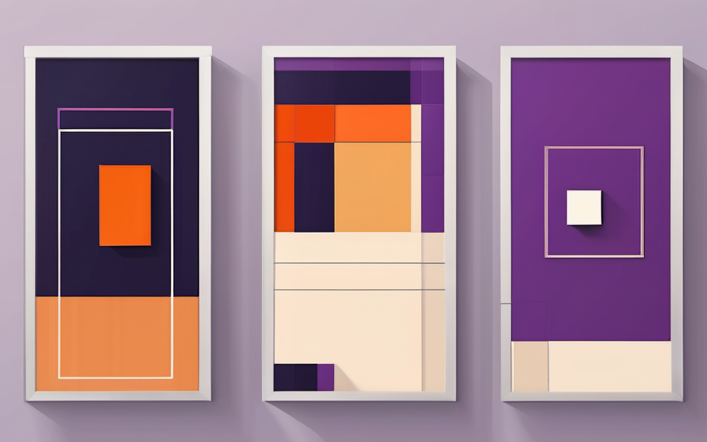
This is where the creative decisions kick in, and where you lay out an event poster the way it should actually read. Color, typography, imagery, layout. Every choice should serve the audience you defined above.
Warm colors create energy and urgency. They work well for product launches, concerts and sales events. Cool colors convey trust and sophistication. Better for conferences, workshops and corporate events. Think about what emotion your poster should evoke, then let color do the work.
Pick one typeface for your headline and one for your body text. Two at most. More than that and your poster looks committee-made. The headline font should match your event’s personality. Clean and geometric for professional events. Bold and expressive for creative or casual gatherings.
Photos of past events build credibility. Abstract or illustrative graphics create intrigue. The rule is simple: imagery should support the text hierarchy, not compete with it. Your poster should guide the eye from headline to CTA in a single, smooth flow.
Test Before You Go Live
The final phase is execution. What separates a good poster from a great one is testing.
Before your poster goes live, test it at actual size. Does it read clearly from three feet away? From twenty? Check contrast ratios. If you’re printing, get a test print. Screen colors rarely match printed output. If it’s digital, check how it looks as a thumbnail on social media.
A poster that looks perfect on a 15-inch screen often falls apart at full size or mobile thumbnail. Testing at actual size is the step that separates posters that work from posters that just look good in the making.
Event Poster Design Checklist Before It Goes Live
Run through this list once, from top to bottom, before the poster reaches print or the feed. Each item is a 30-second check, and most of them catch mistakes that cost a reprint or a weak launch.
- The five elements are in order. Headline, date and time, location or format, reason to attend, call to action. Cut anything else.
- It reads in three seconds from your primary channel distance. From three feet for a wall poster, from thumb size on a phone for social.
- Print files are 300 DPI in CMYK with bleed. Not 72 DPI RGB, even if the designer said “high resolution.”
- Digital files are sized for each channel. 1080 x 1350 for the feed, 1080 x 1920 for stories, not one file everywhere.
- The call to action is impossible to miss. Same weight family as the headline, positioned where the eye lands last.
- Date, time, and venue have been proofread twice. The most common regret with event posters is a correct design with the wrong day.
- Contrast works in dark and light contexts. A poster that only reads in one lighting condition will fail in half of its placements.
- Two typefaces maximum. One for the headline, one for the body. More reads as committee-made.
- White space is doing work. If it feels crowded, remove something before rearranging it.
- You have source files and a print-ready PDF, not just a JPG. Without them, re-typesetting for a new venue or a new size costs the full price again.
A printed, scored version of this same set lives in our poster self-check scorecard, which grades a finished poster out of 24 points across the seven principles. For the format-specific tradeoffs between a print run and a digital-only push, the print vs digital poster design guide walks through cost, turnaround, and file specs for each.
Common Event Poster Design Mistakes
The Information Dump
Your event has details. Lots of them. Schedule, speakers, sponsors, pricing tiers, parking info, accessibility notes. It all feels important. Most of it isn’t.
A poster that includes everything except the essential is the most common mistake we see. A poster should hook people in, not read like an agenda. If someone needs to study your poster to understand what it’s for, you’ve already lost them.
Cut everything that isn’t in your five-element hierarchy. If it doesn’t help someone decide to attend, it doesn’t belong on the poster. Save the details for your website or registration page.
Designing for the Screen, Not the Street
An event poster that works beautifully on Instagram often fails completely on a physical bulletin board. A design optimized for a desktop webpage disappears when shrunk to a social media thumbnail. Your poster needs to work in the environment where it will actually be seen.
Design for your primary distribution channel first. Print poster? Test at full size with real lighting. Social media? Check it at 1080x1350 and at thumbnail size. Digital display? Verify readability from a distance.
No Clear Next Step
A beautiful event poster that doesn’t tell people what to do is just eye candy. Every effective poster needs a clear call to action, whether that’s scanning a QR code, visiting your website, registering now, or saving the date.
Your CTA should be impossible to miss. Same color family as your headline. Bold type. Positioned where the eye naturally lands last in your hierarchy. If your viewer finishes scanning your poster and still doesn’t know what to do next, redesign the CTA.
DIY or Hire Someone (2026 Fiverr Reality Check)
Some event organizers attempt poster design themselves. Using Canva. Using templates. Using whatever they can throw together in an afternoon.
This isn’t always wrong. For a small team meetup or an internal company event, a decent DIY poster can do the job. But there are real costs to the DIY approach that often go uncalculated.
What’s your hourly rate? Six hours on a poster that a designer could produce in two means you’ve already lost money before the poster goes up. Those six hours could’ve gone toward something that actually moves your event forward, like reaching out to potential attendees or confirming speakers.
Templates look like templates. Even the best ones produce work that blends into the visual noise your audience already lives in. A professional poster design stands out because it’s made for your specific event, not because it follows a generic layout.
Here’s the 2026 Fiverr reality: For $35 to 75, you get a professional designer who delivers:
- Print-ready files (300 DPI, CMYK + RGB)
- Source files (AI, PSD, INDD)
- Multiple size variations (A4, A3, social media)
- Unlimited revisions
- Commercial usage rights
- 1 to 3 day delivery
At that price point, DIY rarely makes economic sense unless you have design skills and need instant turnaround. The $35 to 75 tier on Fiverr eliminates the usual DIY pain points (print specs, color profiles, source files, revisions).
For high-stakes events, client-facing gatherings, product launches, and fundraising events, hiring a professional poster designer pays for itself in attendance and brand credibility. If you decide to work with a designer, platforms like Fiverr give you access to experienced designers who specialize in creating effective event posters at prices that make professional quality accessible. Filter for: $35 to 75, Top Rated, 1-day delivery for the best value.
What to Look for When Hiring an Event Poster Designer
The Fiverr Poster Design category holds roughly 163 listings, but only 11 clear the top-rated threshold we use for this guide. Quality event-poster sellers are genuinely scarce, which means the search is short: most events will be handled by a small handful of verified designers. Here is the screening checklist we apply to that 11-gig set, and the signals worth looking for yourself before you order:
- Seller level. Level 2 or Top Rated only, with 600+ reviews. This is the threshold we use to build the 11-gig pricing dataset, and it is the single fastest way to cut through noise.
- Portfolio of event work, not just movie posters. Band posters and film key art are strong, but a designer who has shipped a real venue poster or a multi-size campaign knows how the same message reshapes across formats. Ask for one event example, not a mood board.
- Print specs named in the gig. 300 DPI, CMYK, bleed, and source files. If the gig page does not say 300 DPI explicitly, assume the entry tier will only hand back 72 DPI.
- Unlimited revisions. Standard across the mid tier of the dataset. A Basic tier that caps revisions at 1 to 3 is where surprises show up later.
- Delivery window. 1 to 3 days at Standard, 5+ days only when you are chasing a campaign-level finish. Check the tier you are buying, not the fastest tier on the page.
The price bands in the 11-gig dataset: entry $14 to $45, Standard $45 to $110, Premium $98 to $369. For most events the $45 to $110 Standard tier is the sweet spot, because it is where print-ready files, source files, unlimited revisions, and multiple size variations all come standard. Read how much does poster design cost on Fiverr to walk through what each tier includes before you pick one.
For the structural rules the designer applies to your poster, the poster design principles guide lists the seven fundamentals in order of impact.
What you bring to the conversation (a clear audience, a sharp hierarchy, specific visual preferences) determines whether the result justifies the investment. For the full screening framework and portfolio matching across all four poster types, see how to choose a poster designer.
Event Poster Design Is Strategic Communication
Event poster design is strategic communication. It takes three seconds of attention and turns it into a real-world action. The process is straightforward: define your audience, build your hierarchy, choose your visual approach, execute with testing, and refine. Every step matters.
You don’t need to be a designer to understand poster design. Knowing the process helps you either DIY with confidence or hire the right person and evaluate their work. The steps in this guide serve as your benchmark, regardless of how you choose to create your poster.
Looking for an event poster that drives attendance? Browse professional poster designers on Fiverr who create visually compelling designs that communicate your message instantly. Filter for: $35 to 75, Top Rated, 1-day delivery for the best value.
Last updated: September 2026. Pricing data from 11 top-rated Fiverr poster design gigs analyzed via Playwright scraping (per-tier prices + deliverable breakdowns). All prices are seller-listed USD with service fees included. Affiliate links to Fiverr support our free guides at no extra cost to you.
Related Resources
Poster Design Cluster:
- Poster Design Tips Guide — Core principles deep dive
- Poster Design Principles — The seven foundational rules
- How to Choose a Poster Designer — 4-metric screening of 11 gigs
- Print vs Digital Poster Design — Choose the right format
- Poster Design Cost Guide — Real 11-gig pricing for event posters
Logo Design Cluster:
- How to Brief a Designer — Briefing for event identity
- What Makes a Good Logo — Event logo principles
- How Much Does Logo Design Cost — If you need event branding
Services:
- Poster Design on Fiverr — Event, promo & brand posters
This article contains affiliate links. We may earn a commission at no extra cost to you.
Get It Designed
Poster Design
Event posters, promotional materials, brand campaigns — get stunning poster designs from experienced freelance designers. Real 2026 pricing from 11 tracked Fiverr gigs, deliverable differences by tier, and what to check before you order.
Find Poster Designers on Fiverr*Affiliate links — we may earn a commission