Brand Identity Guide: What It Is and Why Your Logo Isn't Enough
Xin Liu · Founder & Design Service Advisor
Xin helps business owners navigate the freelance design marketplace. He researches platforms, compares services, and publishes practical guides to help you make confident hiring decisions.
Brand Identity: Why a Logo Is Just the Beginning
Most business owners think their visual identity starts and ends with a logo. They commission a mark, pick colors, and call it done. Two years later, they realize inconsistent visuals across their website, social media, packaging, and marketing materials are confusing their audience and weakening their brand. Our 31-gig scrape of the Fiverr logo market shows why this happens so often: sellers that deliver a full brand kit, not just a logo, cluster at the $50 to 110 tier, which most buyers skip in favor of a $19 to 35 entry mark.
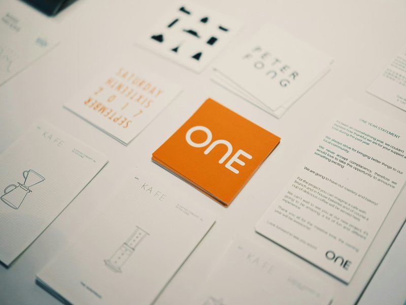
A brand identity is the complete visual system that communicates who you are. It includes your logo, but also your color palette, typography, imagery style, spacing rules, tone of voice, and usage guidelines. When these elements work together consistently, they create recognition that a single logo never could.
Understanding the difference between a logo and a full identity system is the difference between a mark that looks good and a brand that endures.
What Is Brand Identity?
A brand identity is the collection of elements that make your business recognizable and memorable. It’s how you communicate your brand’s personality before anyone reads a single word.
A logo is one element of the system. It’s the most important one, but it’s not the only one. The identity answers these questions:
- What colors represent your brand?
- What fonts communicate your personality?
- What kind of photography and imagery style do you use?
- How do you apply your logo across different contexts?
- What tone of voice matches your visual identity?
- How do you maintain consistency as your business grows?
When a business has a strong identity, every touchpoint feels like it belongs to the same company. When a business lacks one, the website looks different from the social media, which looks different from the email signatures, which looks different from the printed materials.
The Components of a Complete System
1. Logo System
Your logo isn’t a single image. It’s a system of variations designed for different applications. A complete logo system includes:
- Primary logo: The main mark used in most situations
- Secondary logo: A stacked or alternative version for narrow spaces
- Icon or favicon: A simplified mark for small sizes and app icons
- Monochrome versions: Black and white variants for single-color applications
- Reversed versions: White logos for dark backgrounds
Each variation follows the same proportions and clear space rules. This is why understanding what makes a good logo matters. A logo that’s simple enough to adapt across formats is a logo that’s designed well.
2. Color Palette
Your color palette defines the colors that represent your brand. It’s not just the colors you like. It’s the colors your audience associates with your business.
A complete color palette includes:
- Primary colors: 1-2 dominant colors used for key brand elements
- Secondary colors: 2-4 supporting colors that complement the primary palette
- Neutral colors: Backgrounds, text, and structural elements
- Accent colors: Used sparingly for CTAs and highlights
Each color has a specific purpose. Primary colors appear in your logo and major design elements. Secondary colors add variety without competing with the primary palette. Neutrals provide structure and readability. Accents draw attention to important actions.
Color choices communicate personality before anyone reads your content. Blue suggests trust and professionalism. Warm colors create energy and urgency. Neutral palettes convey sophistication and clarity.
3. Typography System
Typography is one of the most powerful elements. Fonts communicate personality the way colors do. A serif font suggests tradition and authority. A geometric sans-serif suggests modernity and clarity. A handwritten script suggests warmth and approachability.

A complete typography system includes:
- Primary font: Used for headlines and key messaging
- Secondary font: Used for body text and readability
- Size hierarchy: Defined sizes for H1 through body text
- Weight variations: Bold, regular, and light usage guidelines
- Line height and spacing rules: Ensuring readability across applications
Your fonts should work together. The headline font and body font should complement each other while remaining distinct enough to create visual hierarchy. This is one of the principles covered in poster design tips and applies equally across all visual communications.
4. Imagery and Photography Style
The images you use communicate as much as your logo and colors. A brand that uses authentic, documentary-style photography communicates differently from one that uses glossy, staged imagery. A brand that uses illustrations communicates differently from one that uses only photos.
A complete imagery system includes:
- Photography style: Authentic vs. staged, color vs. monochrome, close-up vs. wide
- Illustration style: If you use illustrations, what’s the style? Line art? Flat design? Hand-drawn?
- Editing consistency: Color grading, filters, and post-processing rules
- Subject matter: What kinds of people, places, and objects appear in your imagery?
5. Spacing and Layout Rules
How you space elements and arrange content on the page communicates professionalism and attention to detail. Inconsistent spacing makes a brand feel haphazard. Consistent spacing makes it feel deliberate and trustworthy.
Spacing rules include:
- Margin and padding standards: Consistent spacing around elements
- Grid systems: How content aligns and flows across layouts
- Logo clear space: Minimum empty area around your logo
- Minimum sizes: Smallest your logo can appear while remaining legible
6. Brand Guidelines
Brand guidelines are the document that ties everything together. They’re not just a reference for designers. They’re instructions for anyone who creates content for your brand, whether that’s your team, freelancers, or agencies.
Good brand guidelines include:
- Logo usage rules and variations
- Color codes (hex, RGB, CMYK, Pantone)
- Typography specifications
- Imagery style guidelines
- Tone of voice examples
- Do’s and don’ts for common scenarios
- File format requirements
Without guidelines, the system drifts. Different people make different choices, and the brand loses consistency.
Why Your Logo Alone Isn’t Enough
A logo without a supporting system is like a person without a voice. It has a face, but nothing else to communicate with.
Consider these scenarios:
The Social Media Problem. You have a logo. Your social media posts use it, but each post looks different. Some use your colors. Some don’t. Some stretch the logo. Some place it in random positions. Your followers can’t tell these posts are from the same brand.
The Website Problem. Your website’s homepage matches your logo. But your blog uses different colors. Your product pages use different fonts. Your contact page looks like it belongs to a different company. Visitors leave confused about who you are.
The Print Problem. Your business cards look professional. But your brochures, flyers, and packaging use different colors and layouts. When customers receive these materials, they don’t feel like they come from the same company.
In each case, the problem isn’t the logo. The problem is that the logo exists without a supporting system. A complete brand identity provides that system. And that system is only as strong as the brief you hand a designer at the start, and our how to brief a designer guide covers exactly how to specify color, typography, and voice so the system you get back actually holds together.
How a Strong Identity Supports Business Growth
A strong identity isn’t just about looking consistent. It creates tangible business value:
Recognition. Consistent visual elements build familiarity. When your audience sees your colors, fonts, and imagery style, they know it’s you before they read your name. Recognition reduces the cognitive load of deciding whether to trust you.
Professionalism. Inconsistency signals amateurism. When your materials look like they come from different companies, customers question your competence. Consistency signals that you pay attention to detail.
Efficiency. A visual system means your team doesn’t have to make the same decisions repeatedly. When guidelines exist, creating new content is faster. Designers don’t start from scratch. Marketers don’t guess what colors to use.
Scalability. As your business grows, more people create content. Without guidelines, consistency erodes. With guidelines, new team members can maintain brand quality without constant oversight.
Premium positioning. Brands with strong identities command higher prices. Customers pay more for consistency because it signals professionalism and reliability.
From Logo to Identity: The Process
Building a complete visual system takes time. It’s not something you commission alongside your logo and expect to have done. A proper identity process follows these stages:
Stage 1: Brand Strategy
Before any visual work, you need to understand your brand’s position. What are your values? Who is your audience? What makes you different? What tone of voice feels natural for your business?
This stage overlaps with how to brief a designer. A clear brief at this stage prevents costly revisions later.
Stage 2: Logo Design
Your logo is the centerpiece, but it’s not the only piece. A good logo design process includes creating a logo system with multiple variations from the start, not just a single mark.
Stage 3: Visual System Development
Once the logo is established, develop the supporting elements. Choose your color palette. Select your typefaces. Define your imagery style. Create spacing and layout rules.
Stage 4: Guidelines Documentation
Compile everything into a brand guidelines document. This becomes the reference for anyone creating content for your brand.
Stage 5: Implementation
Apply your visual system across all touchpoints. Website, social media, email signatures, business cards, packaging, marketing materials. Inconsistencies that appear during implementation reveal gaps in your guidelines that need addressing.
Common Mistakes in Building an Identity
Starting with the logo and never finishing. Many business owners design a logo and stop. They never develop the supporting system. The logo exists in isolation, and the identity never materializes.
Copying competitors. Choosing colors, fonts, and imagery because your competitors use them creates a brand that blends in instead of standing out. Your identity should reflect your uniqueness, not your competition’s choices.
Adding too many elements. A system with 20 colors, 5 fonts, and dozens of imagery styles is not a system. It’s a collection of choices with no coherence. Constraints create strength. Limit your palette. Limit your typefaces. Limit your imagery approach.
Treating it as a one-time project. Identity evolves as your business grows. What works for a startup doesn’t work for an established company. Update your guidelines as your brand matures, but maintain core consistency.
Ignoring implementation. A system on paper means nothing if it’s not applied consistently. Invest in implementing your identity across all touchpoints, even if it takes time.
Budget Considerations: Logo vs. Identity (2026 Fiverr Reality Check)
Building a complete system costs more than a logo alone. But the investment pays for itself through consistency, efficiency, and professional perception.
Real Fiverr pricing from 31 top-rated logo gigs (Sept 2026):
We pulled the actual Basic/Standard/Premium tier prices from 31 top-rated Fiverr logo gigs (every one a Level 2 or Top Rated / Vetted Pro seller with 600+ reviews, verified on the gig page) out of a pool of 174 “logo design” listings in Fiverr’s Logo Design category scraped in September 2026.
| Service Level | Median Price | Range Across the 31 Gigs | What It Typically Buys |
|---|---|---|---|
| Budget Fix / Starter | $30 | $9 to $470 | 1 concept, basic vector (SVG/PNG), 3 to 5 revisions, mockup |
| Professional Brand System | $83 | $25 to $891 | 2 to 3 concepts, unlimited revisions, full brand kit (color palette, typography, social media kit, stationery, source files AI/EPS/PDF) ⭐ |
| Premium Brand System | $156 | $46 to $1,577 | Strategy consultation, 3 to 5 custom concepts, comprehensive brand guidelines, implementation assets, priority support |
Data source: 31 qualifying top-rated gigs out of 174 listings (Fiverr Logo Design category, pages 1 to 5), scraped September 2026 via Playwright. Download the dataset (31 tier sets with gig links) and the per-tier deliverable dataset. All prices are seller-listed USD with service fees included.
Key findings from our data:
- Median professional brand system: $83 (Standard tier), the tier that most often bundles the full brand kit.
- The P/B spread is ~5×: Premium median is $156, Basic median is $30; the identity work (strategy, guidelines, implementation assets) is where the top tier earns its price.
- Full brand kits (color palette, typography, social kit, stationery) are the most common value-add at the Standard/Premium tiers, not at entry.
- Unlimited revisions is standard at the $50+ tier.
Real Fiverr Examples for Brand Identity (Sept 2026)
| Service Need | Gig Title | Basic / Std / Premium | What’s Included |
|---|---|---|---|
| No system → Full brand kit | “Custom minimalist logo + full brand kit” (x_studioz, Level 2) | $51 / $125 / $188 | Logo + brand kit, 1 to 3 concepts, source files |
| Logo + brand identity kit | “Brand identity kit with a logo” (poppy_lights, Top Rated) | $109 / $211 / $422 | Identity kit: logo, color, type, guidelines |
| Minimalist logo + brand identity | “Create minimalist business logo, brand id…” (designrevail, Level 2) | $51 / $125 / $178 | Logo + brand identity, unlimited revisions |
| Brand style guide + corporate identity | “Design brand style guide, corporate identity…” (thedesignaffair, Vetted Pro) | $135 / $258 / $396 | Multi-page style guide, corporate identity system |
| Premium business logo + branding | “Design your business logo and branding” (newbold3d, Top Rated) | $469 / $891 / $1,577 | Complete logo system, full stationery + social kit, strategy |
Bottom line: A complete professional brand system on Fiverr typically costs $50 to 110 (median Standard $83) and includes unlimited revisions + a full brand kit (color palette, fonts, social media kit, stationery, source files). That’s a fraction of agency rates ($2,500+).
This article contains affiliate links; we may earn a commission at no extra cost to you. Full disclosure.
When You’re Ready to Build Your Identity
If you have a logo but no supporting system, you’re not alone. Many businesses are in this position. The good news is that building an identity system is a structured process with clear steps.
Start by auditing your current visual materials. Where do you see inconsistencies? What decisions have you made ad hoc? What would a brand guidelines document answer for you?
Then work with a designer who understands brand systems, not just logo design. A designer who creates identities knows how to build a system that grows with your business. When you’re ready to find the right designer, check out Fiverr and filter for: $35 to 110, Top Rated/Pro Verified, unlimited revisions for the best professional brand system.
The Bottom Line
A logo is the face of your brand. Identity is the whole person. It’s the visual system that communicates your brand consistently across every touchpoint, from your website to your business cards to your social media posts.
Building an identity takes more investment than a logo alone. But the return is recognition, professionalism, efficiency, and scalability. A brand without a system is a logo without a body. A brand with a system, a complete brand identity, is a visual identity that works for you every day.
Last updated: September 2026. Pricing data from 31 top-rated Fiverr logo design gigs analyzed via Playwright scraping (per-tier prices + deliverable breakdowns). All prices are seller-listed USD with service fees included. Affiliate links to Fiverr support our free guides at no extra cost to you.
Related Resources
Logo Design Cluster:
- How Much Does Logo Design Cost — Logo budget vs. identity budget
- What Makes a Good Logo — The foundation element
- Common Logo Design Mistakes — Mistakes that break systems
- Professional Logo Design Process — Process scales to identity
- How to Brief a Designer — Briefing for systems, not just logos
Poster Design Cluster:
- Poster Design Tips Guide — Applying your identity system
Services:
- Logo Design on Fiverr — Vetted designers, transparent pricing
This article contains affiliate links. We may earn a commission at no extra cost to you.
Get It Designed
Logo Design
Get a unique, memorable logo designed by professional freelancers. From concept to final files — your brand identity starts here. Real 2026 pricing from 31 tracked Fiverr gigs, deliverable differences by tier, and what to check before you order.
Browse Logo Designers on Fiverr*Affiliate links — we may earn a commission